Worldpay – Icon Design
Worldpay are an American fin-tech company that specialises in payments and work with 95% of the world’s leading banks and businesses.
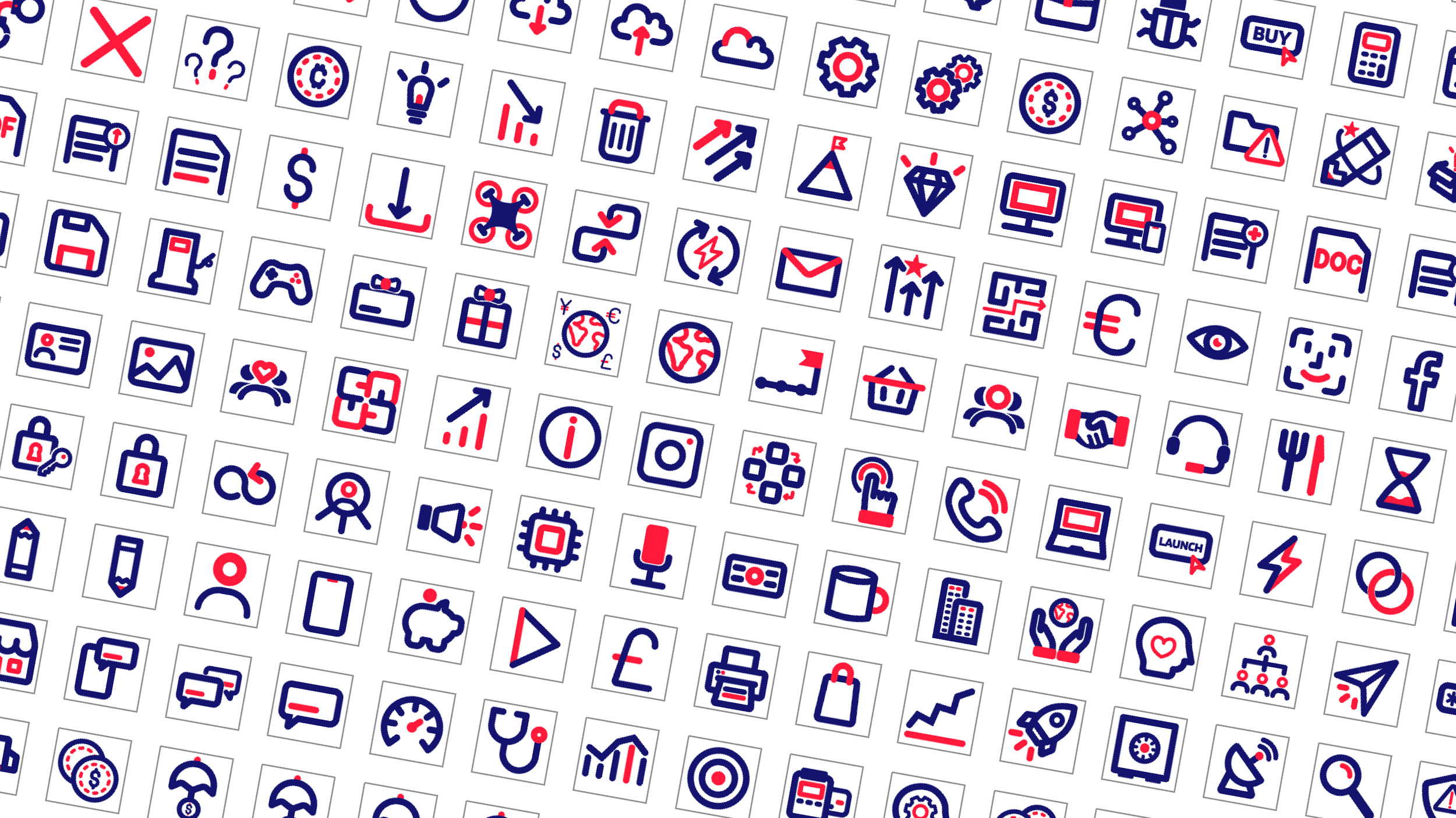
From the end of 2023, we were tasked to help revolutionise a new Worldpay brand. Part of this new brand included a set of over 200 icons to be used across all collateral.


Whilst using a grid system, we created a set of unique icons that complimented Worldpay’s graphic device – a soft, rounded corner card.
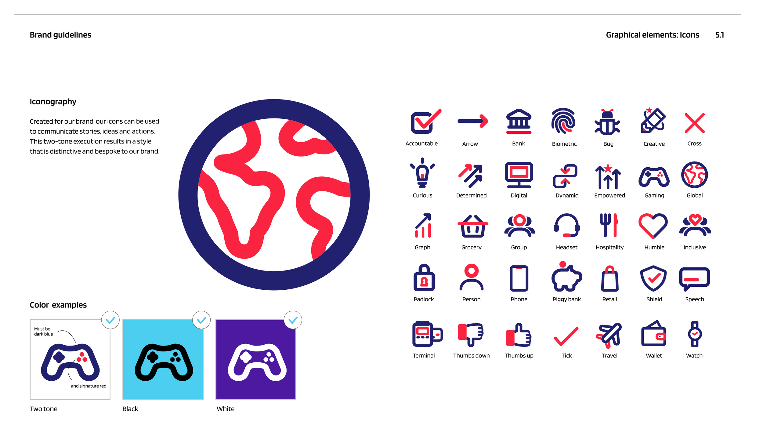
Worldpay, asked for the icons to incorporate a two-tone approach, using their signature red and dark blue to differentiate themselves from most other fin-techs.
Each icon was also created in white and black, allowing for accessibility and applications that might not allow full colour.
Worldpay brand guidelines showing icon instructions.


